Princeton University
Visual Arts Program
VIS 415, R-e-s-e-a-r-c-h
Mondays, 12:30–4:20 pm
Spring 2023
This studio course builds on the skills and concepts of the 200-level Graphic Design classes. VIS 415 is structured around one semester-length assignment which connects graphic design to the process of visual research. The single project allows an individual in-depth investigation of a broader class assignment, leveraging online platforms with students working together to refine their individual projects through a mix of critique and instruction. Studio work is supplemented by guests, readings, and lectures. The course will explore design research in its many forms by doing it.
January 27, 2025
It starts with a postcard.
Reading
Cretan Correspondence School
Resources
Spiral Jetty (Robert Smithson)
Spiral Jetty Extraction Movie 1970 (Robert Smithson)
Spiral Jetty Aerial Documentation
M-u-l-t-i-p-l-i-c-i-t-y
The Serving Library
Exercise
How to Draw & Count Labyrinths
It starts with a postcard.
Reading
Cretan Correspondence School
Resources
Spiral Jetty (Robert Smithson)
Spiral Jetty Extraction Movie 1970 (Robert Smithson)
Spiral Jetty Aerial Documentation
M-u-l-t-i-p-l-i-c-i-t-y
The Serving Library
Exercise
How to Draw & Count Labyrinths
It starts with a postcard.
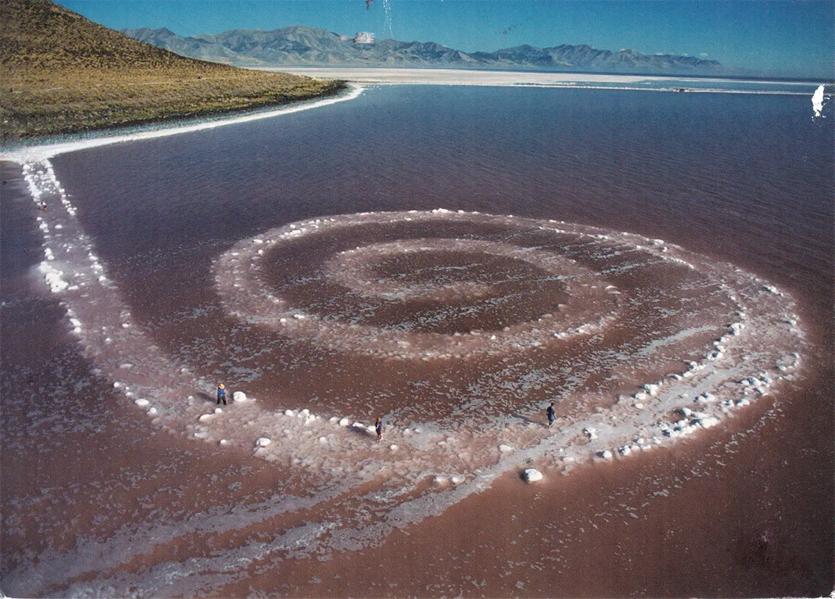
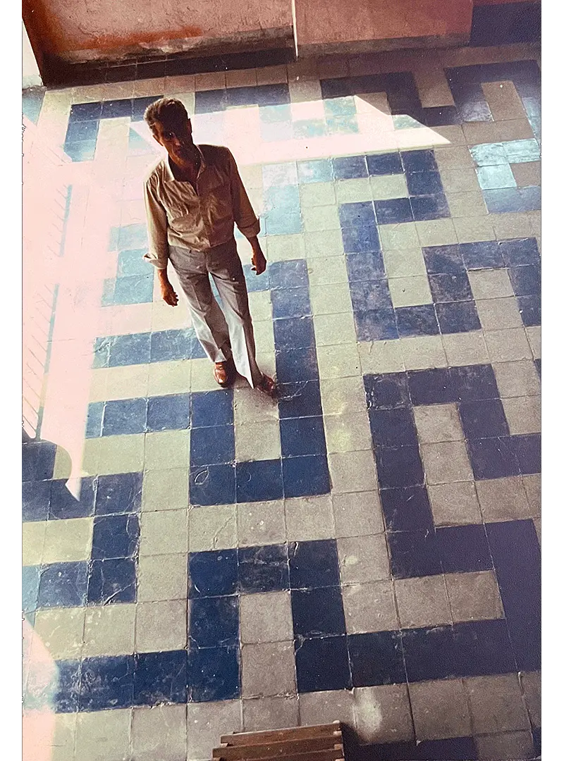
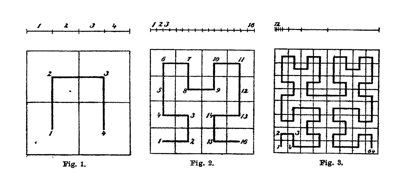
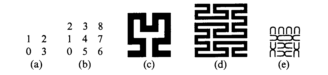
Unannounced and unattributed, it arrived in the mailbox this fall with Robert Smithson’s earthwork, Spiral Jetty (1970), on the front and, on the back, instructions for How to Draw & Count Labyrinths. Dia Art Foundation was crossed out and replaced by Cretan Correspondence School of Topology. The card was addressed to Eden Reinfurt, a then 16-year-old high school student in New York City. She later guessed the sender must be Philip Ording, a topologist, professor, and author in Brooklyn.
The postcard cued a wandering back and forth conversation conducted through the U.S. Postal Service. Eden worked through the problems posed on the first postcard, drawing her answers on a return card which went back in the mail. Four more postcards followed in sequence, each developing the ideas a bit further and posing additional problems. Some were answered correctly.
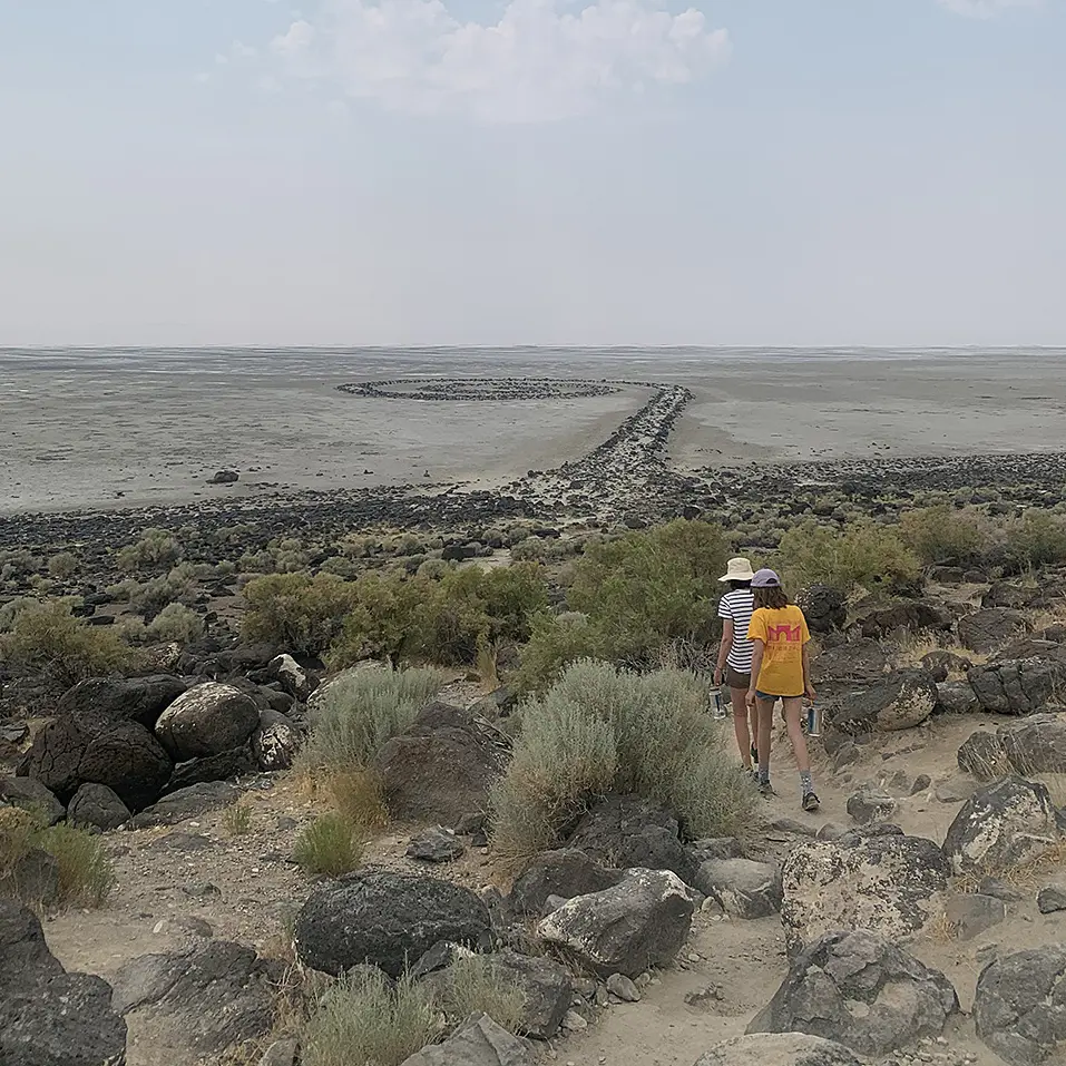
It turns out that my family had just visited Spiral Jetty that summer. The drive to the site was half of the experience, reminding me that “the journey is the destination” or “the path is made by walking” or some other tired, but true formulation. On a two-hour drive over washboard dirt roads, we read this text aloud by Robert Smithson where he describes how he landed on this “meandering zone.”
Philip, a friend and previously my co-teacher for M-u-l-t-i-p-l-i-c-i-t-y, Problems in Graphic Design & Topology knew we had visited Smithson’s work. And he had been inspired by Mathematical Research Postcards, a series initiated by Liam Watson that “publishes” results in this small format. However, Philip scarcely could have known that by the time his postcard arrived, I was thinking a lot about forms like the spiral for another project.
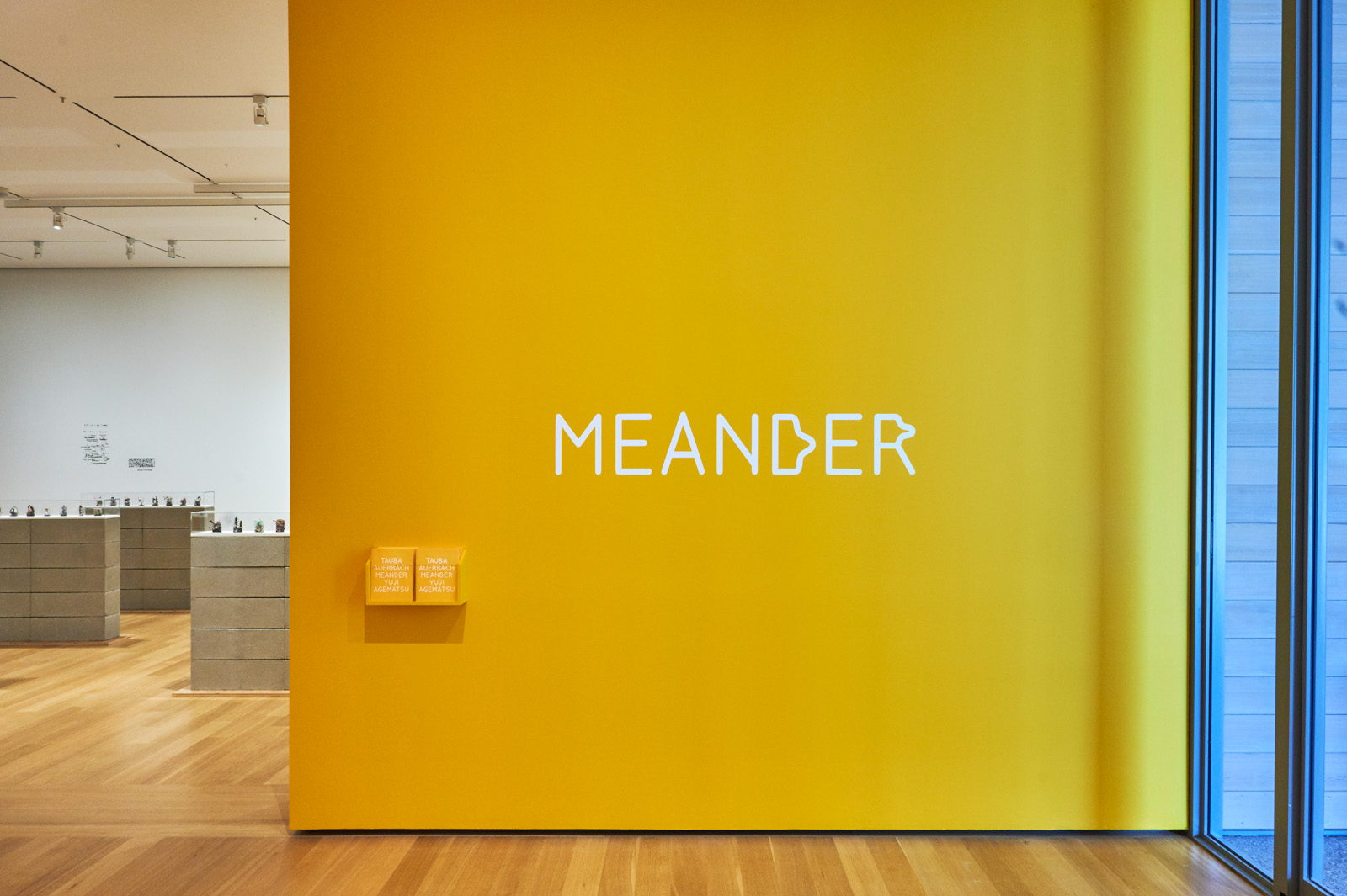
That project was an exhibition at the Clark Art Institute called Meander. It was a two-artist show with Tauba Auerbach and Yuji Agematsu, organized by curator Robert Wiesenberger around the form of the meander, or self-avoiding line. Here are the exhibition graphics I designed:
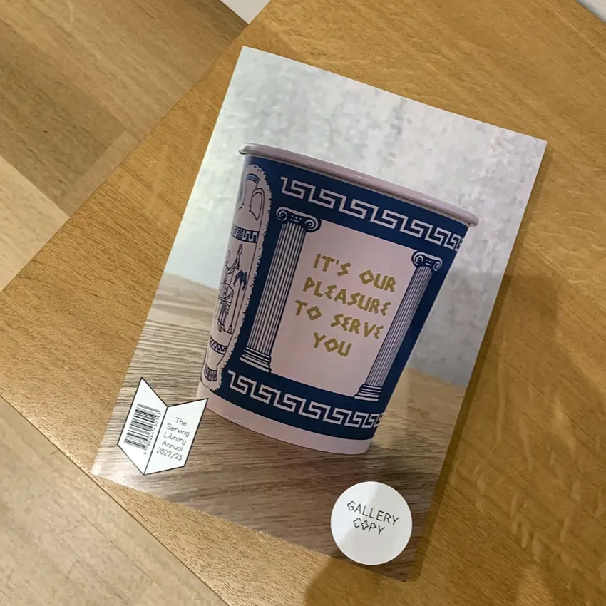
And with my project The Serving Library, we also edited and assembled an issue of our journal which doubled as a catalog for the exhibition. Bringing it back full circle (or rather full meander?), the set of postcards which started this eventually appeared in that publication. Here’s the issue, on a bench in the gallery in the exhibition [↓].
Continues in class . . .
Unannounced and unattributed, it arrived in the mailbox this fall with Robert Smithson’s earthwork, Spiral Jetty (1970), on the front and, on the back, instructions for How to Draw & Count Labyrinths. Dia Art Foundation was crossed out and replaced by Cretan Correspondence School of Topology. The card was addressed to Eden Reinfurt, a then 16-year-old high school student in New York City. She later guessed the sender must be Philip Ording, a topologist, professor, and author in Brooklyn.
The postcard cued a wandering back and forth conversation conducted through the U.S. Postal Service. Eden worked through the problems posed on the first postcard, drawing her answers on a return card which went back in the mail. Four more postcards followed in sequence, each developing the ideas a bit further and posing additional problems. Some were answered correctly.
It turns out that my family had just visited Spiral Jetty that summer. The drive to the site was half of the experience, reminding me that “the journey is the destination” or “the path is made by walking” or some other tired, but true formulation. On a two-hour drive over washboard dirt roads, we read this text aloud by Robert Smithson where he describes how he landed on this “meandering zone.”
Philip, a friend and previously my co-teacher for M-u-l-t-i-p-l-i-c-i-t-y, Problems in Graphic Design & Topology knew we had visited Smithson’s work. And he had been inspired by Mathematical Research Postcards, a series initiated by Liam Watson that “publishes” results in this small format. However, Philip scarcely could have known that by the time his postcard arrived, I was thinking a lot about forms like the spiral for another project.
That project was an exhibition at the Clark Art Institute called Meander. It was a two-artist show with Tauba Auerbach and Yuji Agematsu, organized by curator Robert Wiesenberger around the form of the meander, or self-avoiding line. Here are the exhibition graphics I designed:
And with my project The Serving Library, we also edited and assembled an issue of our journal which doubled as a catalog for the exhibition. Bringing it back full circle (or rather full meander?), the set of postcards which started this eventually appeared in that publication. Here’s the issue, on a bench in the gallery in the exhibition [↓].
Continues in class . . .
February 3, 2025
The moving point fills the whole space
Reading
The Moving Point Fills the Whole Space (Tauba Auerbach)
Resources
Selected Works of Giuseppe Peano (Hubert Kennedy)
Curves… in… spaaaace!
Tauba Auerbach
A Peano Curve Turtle
Diagonal Press
Tauba Auerbach Peano Poem talk
Space Filling Curves (Geometry Film Project)
Assignment
Research, Reconsider, Repeat
In an 1890 paper, Italian mathematician Giuseppe Peano first described a plane-filling curve:
His curve suggested a mapping from the single dimension of points on a line to the paired dimensions of coordinates in a plane. Set theorist Georg Cantor had already devised in 1874 a one-to-one correspondence between the points on a line and the points on a surface, but the correspondence dissolved the continuity of the line. Peano built the argument in his 1890 paper strictly analytically using only the properties of the numbers between zero and one. He included no drawing of his curve.
One year later, German mathematician David Hilbert offered a drawing based on the curves Peano had conjured. It is a recursive form beginning with a bent line where each segment is replaced by a smaller, self-similar bend, becoming denser and denser, continuing infinitely to completely fill a plane on its theoretical last iteration. The global trajectory of the path (in this case up, to the right, and down) remains unchanged throughout the iterations. Here is Hilbert’s drawing of the first three steps in the process:
Peano seems not to have drawn the curve himself, even in his own notes, until the fifth and final edition of his Formulario Mathematico, published almost two decades later, in 1908. Here are Peano’s drawings from the Formulario, which include Hilbert’s example using base two (c) and his own example using base three (d):
This drawing is from a family of curves most often referred to as a “Peano curve,” with which artist Tauba Auerbach has long been fascinated, incorporating them into their paintings, drawings, sculptures, and the occasional concrete poem.
Auerbach’s Ligature Drawings are something close to a writing practice, using markers on oversized graph paper to produce bent lines which develop as they are drawn. The lines often return on themselves, often repeat, and inevitably connect. Most are stamped with the date and they pile up. Their abundance, the programmatic movement of the pen, and the meandering compactness of the lines recalls something from Peano’s own description of his curve as
Continues in class . . .
There exists a continuous curve which goes through every point of a plane ... This result is of interest in the study of the foundations of geometry, for there does not exist a specific character which distinguishes a curve from a surface.This curve was a radical proposal. Peano asserted that a continuous one-dimensional line could be constructed in a specific way so that it would wind its way through every point of a two-dimensional square.
His curve suggested a mapping from the single dimension of points on a line to the paired dimensions of coordinates in a plane. Set theorist Georg Cantor had already devised in 1874 a one-to-one correspondence between the points on a line and the points on a surface, but the correspondence dissolved the continuity of the line. Peano built the argument in his 1890 paper strictly analytically using only the properties of the numbers between zero and one. He included no drawing of his curve.
One year later, German mathematician David Hilbert offered a drawing based on the curves Peano had conjured. It is a recursive form beginning with a bent line where each segment is replaced by a smaller, self-similar bend, becoming denser and denser, continuing infinitely to completely fill a plane on its theoretical last iteration. The global trajectory of the path (in this case up, to the right, and down) remains unchanged throughout the iterations. Here is Hilbert’s drawing of the first three steps in the process:
Peano seems not to have drawn the curve himself, even in his own notes, until the fifth and final edition of his Formulario Mathematico, published almost two decades later, in 1908. Here are Peano’s drawings from the Formulario, which include Hilbert’s example using base two (c) and his own example using base three (d):
This drawing is from a family of curves most often referred to as a “Peano curve,” with which artist Tauba Auerbach has long been fascinated, incorporating them into their paintings, drawings, sculptures, and the occasional concrete poem.
Auerbach’s Ligature Drawings are something close to a writing practice, using markers on oversized graph paper to produce bent lines which develop as they are drawn. The lines often return on themselves, often repeat, and inevitably connect. Most are stamped with the date and they pile up. Their abundance, the programmatic movement of the pen, and the meandering compactness of the lines recalls something from Peano’s own description of his curve as
a point in n-dimensional space, which is a continuous function of a real variable, or of time, such that the trajectory of the moving point fills the whole space.
Continues in class . . .
February 10, 2025
The discovery of the triangle
Readings
The Discovery of the Triangle (Bruno Munari)
The Design of Research (Bruno Munari)
Resources
Visual Research, Sturctures, Design (Bruno Munari)
Mun Art, the comprehensive Munari archive
The Topology Films Project, Space-filling Curves
Quaderni di Design
Assignment
Research, Reconsider, Repeat (proposed subjects)
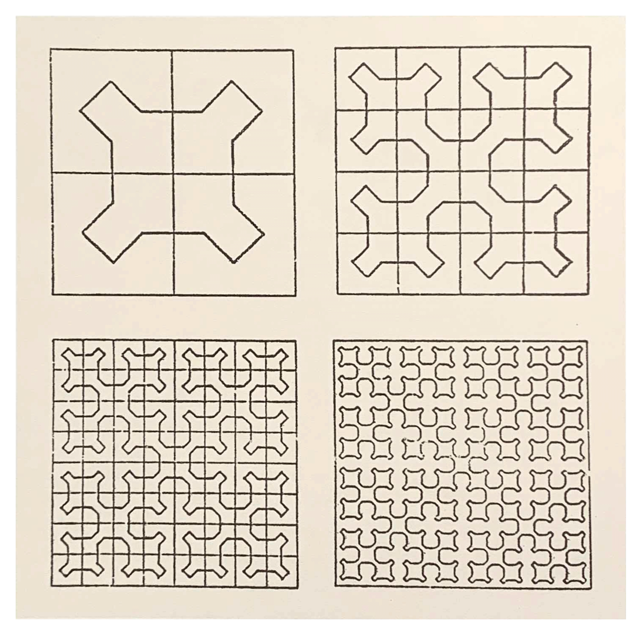
Italian artist and designer Bruno Munari was also fascinated by Peano’s curious curve. This space-filling curve is a mathematical absurdity — a one-dimensional entity passing as a two-dimensional figure. I'd guess it was this paradox that drew Munari to the form starting in the late 1960s. Here’s a set of drawings attempting to understand the form [↓]:
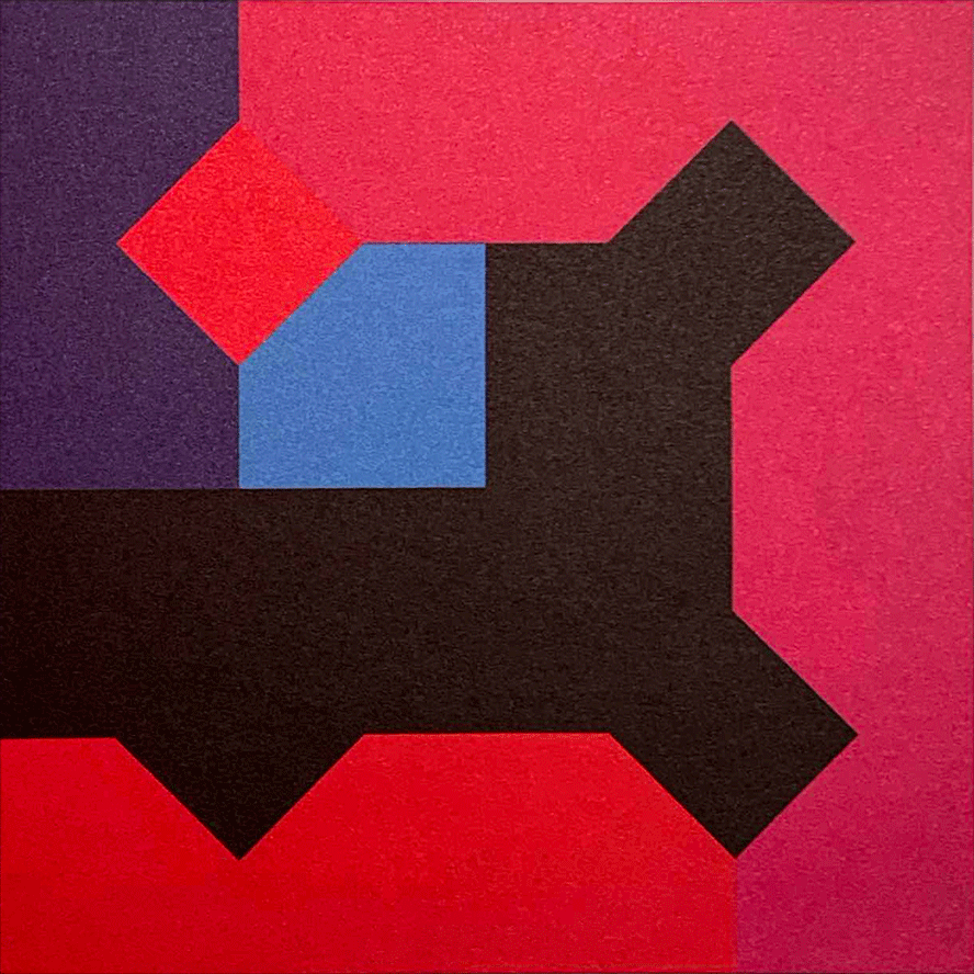
Munari called these specific algebraic-geometric constructions "pathological curves." He began to explore them in his work. In December 1969 Munari made a print for La Rinascente department store in Milan called Arbitrary Variations on the Peano Curve. I expect “Arbitrary” is the key word here. Soon he started making paintings and prints based on Peano curves where he indulged his instinct to oppose the “scientific nature” of the mathematical forms with an irrational component:
Munari continues:
He made a set of prints for Danese Milano based on the images. These are his color studies which give some slight insight to the process. And here is a finished picture [↓]. I love these so much.
All of this was research, design research, for Munari. Design research was an active concern for him from the 1960s onwards. In Codice Ovvio (1971), he described the research process:
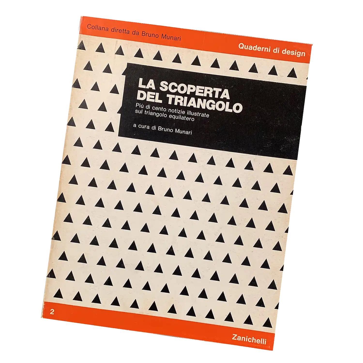
About ten years later, he became editor of a publication series which provided a platform for this work. From 1976, he was director of Quaderni di design (Design Notebooks) published by Zanichelli. It’s an exceptional collection, each issue presenting one single design research project. The second issue presented one of Munari’s own projects, The Discovery of the Triangle [↓]:
Continues in class . . .
Munari called these specific algebraic-geometric constructions "pathological curves." He began to explore them in his work. In December 1969 Munari made a print for La Rinascente department store in Milan called Arbitrary Variations on the Peano Curve. I expect “Arbitrary” is the key word here. Soon he started making paintings and prints based on Peano curves where he indulged his instinct to oppose the “scientific nature” of the mathematical forms with an irrational component:
My proposal, absolutely superfluous to mathematical speculation, but curious from an aesthetic point of view, is to place certain colors in the areas delimited by the line
Munari continues:
I wanted to try to insert in this very rigorous, mathematical structure an emotional fact based instead on the sensitivity of color. I asked myself: what happens if I insert a fact of chromatic sensitivity into a strictly logical problem? The truth that color finds its own structure even if it has an emotional origin because Peano can explain its structure with logic while I cannot explain in words what sensitivity is. So it is a relationship between sensitivity, intuition and logic.
He made a set of prints for Danese Milano based on the images. These are his color studies which give some slight insight to the process. And here is a finished picture [↓]. I love these so much.
All of this was research, design research, for Munari. Design research was an active concern for him from the 1960s onwards. In Codice Ovvio (1971), he described the research process:
Unlike artists, designers . . . do not come up with marvelous little sketches that someone else will later reproduce, they experiment with optical, physical, geometric, topological or mechanical phenomena . . . fine-tuning their components in order to maximize their effect, researching the material best suited to guarantee a maximum of communication at the lowest cost. They subsequently develop the best mechanical technique and finally create a prototype, which is not an artist’s unique masterpiece, but simply the model for the whole series. Whereas in art, reproductions are always inferior to the original, in this case the prototype is always inferior to the final products.
About ten years later, he became editor of a publication series which provided a platform for this work. From 1976, he was director of Quaderni di design (Design Notebooks) published by Zanichelli. It’s an exceptional collection, each issue presenting one single design research project. The second issue presented one of Munari’s own projects, The Discovery of the Triangle [↓]:
Continues in class . . .
February 17, 2025
The discovery of the triangle
Readings
The Discovery of the Triangle (Bruno Munari)
The Design of Research (Bruno Munari)
Resources
Visual Research, Sturctures, Design (Bruno Munari)
Mun Art, the comprehensive Munari archive
The Topology Films Project, Space-filling Curves
Quaderni di Design
Assignment
Research, Reconsider, Repeat (proposed subjects)
Italian artist and designer Bruno Munari was also fascinated by Peano’s curious curve. This space-filling curve is a mathematical absurdity — a one-dimensional entity passing as a two-dimensional figure. I'd guess it was this paradox that drew Munari to the form starting in the late 1960s. Here’s a set of drawings attempting to understand the form [↓]:
Munari called these specific algebraic-geometric constructions "pathological curves." He began to explore them in his work. In December 1969 Munari made a print for La Rinascente department store in Milan called Arbitrary Variations on the Peano Curve. I expect “Arbitrary” is the key word here. Soon he started making paintings and prints based on Peano curves where he indulged his instinct to oppose the “scientific nature” of the mathematical forms with an irrational component:
Munari continues:
He made a set of prints for Danese Milano based on the images. These are his color studies which give some slight insight to the process. And here is a finished picture [↓]. I love these so much.
All of this was research, design research, for Munari. Design research was an active concern for him from the 1960s onwards. In Codice Ovvio (1971), he described the research process:
About ten years later, he became editor of a publication series which provided a platform for this work. From 1976, he was director of Quaderni di design (Design Notebooks) published by Zanichelli. It’s an exceptional collection, each issue presenting one single design research project. The second issue presented one of Munari’s own projects, The Discovery of the Triangle [↓]:
Continues in class . . .
Munari called these specific algebraic-geometric constructions "pathological curves." He began to explore them in his work. In December 1969 Munari made a print for La Rinascente department store in Milan called Arbitrary Variations on the Peano Curve. I expect “Arbitrary” is the key word here. Soon he started making paintings and prints based on Peano curves where he indulged his instinct to oppose the “scientific nature” of the mathematical forms with an irrational component:
My proposal, absolutely superfluous to mathematical speculation, but curious from an aesthetic point of view, is to place certain colors in the areas delimited by the line
Munari continues:
I wanted to try to insert in this very rigorous, mathematical structure an emotional fact based instead on the sensitivity of color. I asked myself: what happens if I insert a fact of chromatic sensitivity into a strictly logical problem? The truth that color finds its own structure even if it has an emotional origin because Peano can explain its structure with logic while I cannot explain in words what sensitivity is. So it is a relationship between sensitivity, intuition and logic.
He made a set of prints for Danese Milano based on the images. These are his color studies which give some slight insight to the process. And here is a finished picture [↓]. I love these so much.
All of this was research, design research, for Munari. Design research was an active concern for him from the 1960s onwards. In Codice Ovvio (1971), he described the research process:
Unlike artists, designers . . . do not come up with marvelous little sketches that someone else will later reproduce, they experiment with optical, physical, geometric, topological or mechanical phenomena . . . fine-tuning their components in order to maximize their effect, researching the material best suited to guarantee a maximum of communication at the lowest cost. They subsequently develop the best mechanical technique and finally create a prototype, which is not an artist’s unique masterpiece, but simply the model for the whole series. Whereas in art, reproductions are always inferior to the original, in this case the prototype is always inferior to the final products.
About ten years later, he became editor of a publication series which provided a platform for this work. From 1976, he was director of Quaderni di design (Design Notebooks) published by Zanichelli. It’s an exceptional collection, each issue presenting one single design research project. The second issue presented one of Munari’s own projects, The Discovery of the Triangle [↓]:
Continues in class . . .
February 24, 2025
Not *an* apple, but *the* apple
Readings
Investigation Into Perceptive Ambiguities (Francesca Giacomelli)
Resources
Enzo Mari website
The Enzo Mari Method (1968)
Enzo Mari curated by Hans Ulrich Obrist with Francesca Giacomelli
A Method Arising from the Initial Research Into the Perceptive Ambiguity of Three-Dimensional Space
Interview
Assignment
Research, Reconsider, Repeat (check-in #1)
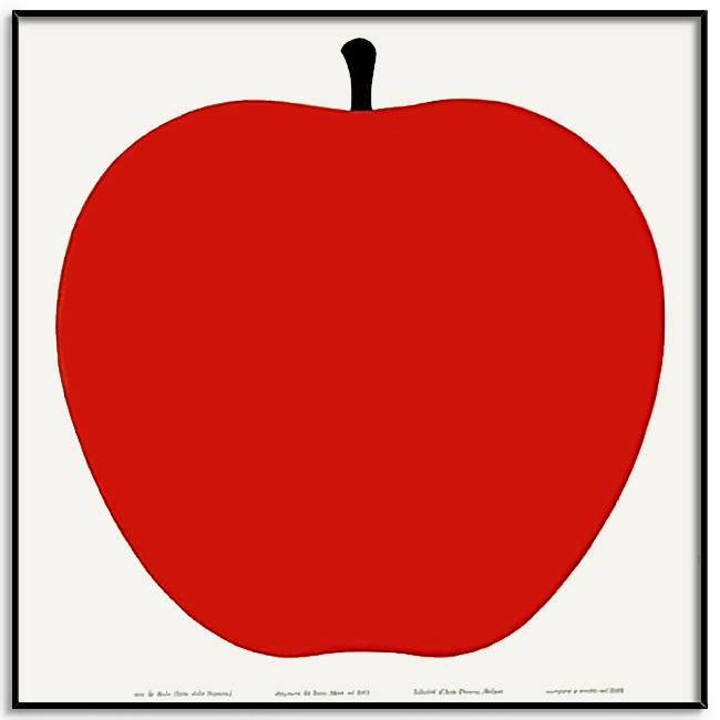
Enzo Mari spent the year 1957 drawing an apple. The result, La Mela, is a large silkscreen print [↓] produced as an artist multiple by Danese Milano continuously since.
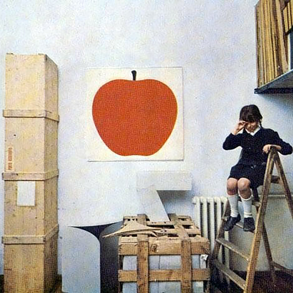
Mari had the apple up in his studio [↓] for a year, considering and adjusting its form — trying to get the curve just right.
He lavished time on the drawing, preparing it for manufacture by abolishing detail and reducing it to an essential form. He was not looking to draw *an* apple, but rather *the* apple — a perfect symbol designed for the serial logic of industrial reproduction. In place of the unique work of art and its privileged market, multiples used contemporary manufacturing to produce many exact copies circulated as consumer products. The Apple was only the first in a series (Serie della Natura) of similar prints Mari designed over the next ten years.
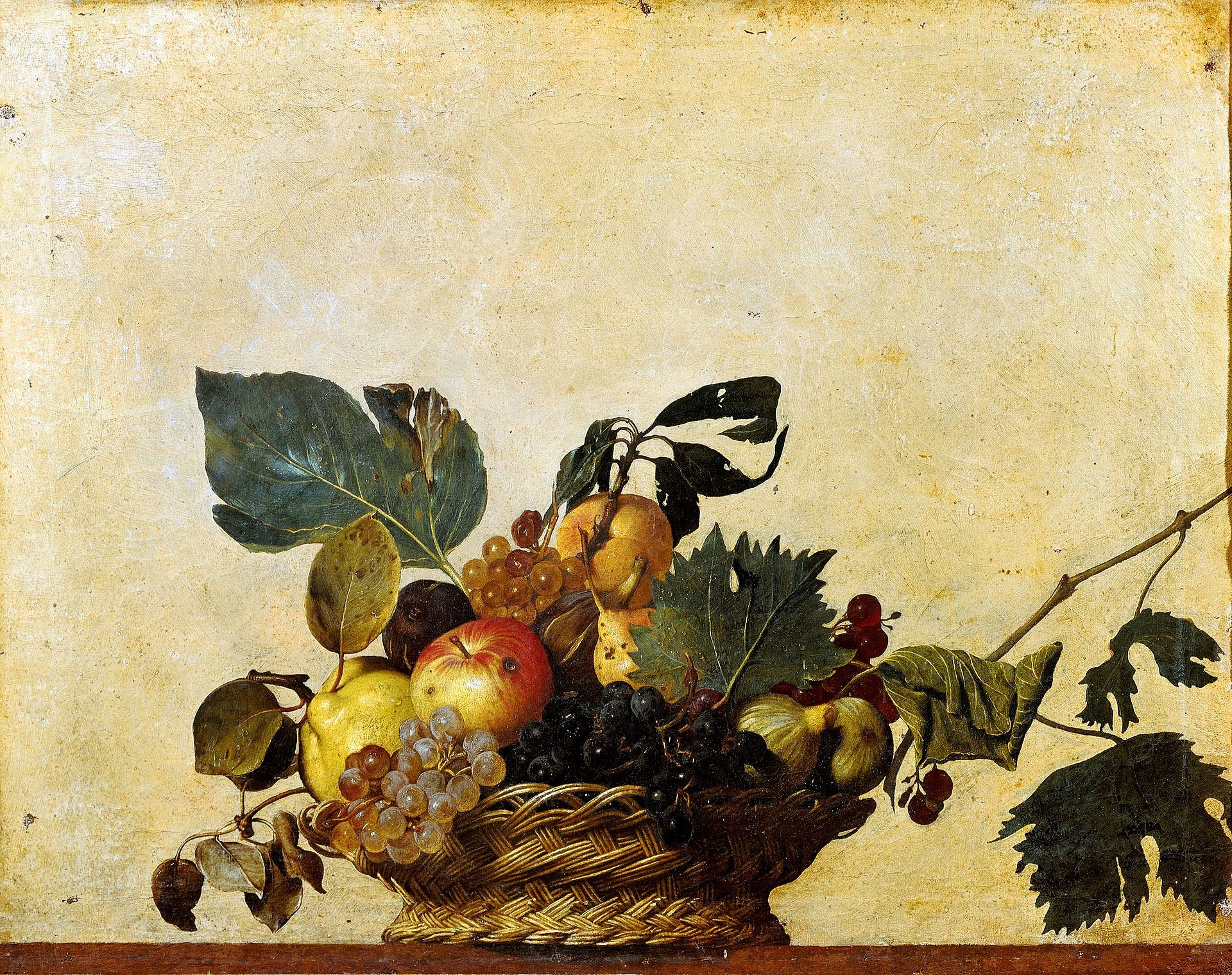
Curator and Enzo Mari archivist Francesca Giacomelli, describes his departure point for the series in the catalog for a recent comprehensive exhibition at The Triennale in Milan. He wanted a subject that was easily understood, and started from Caravaggio’s Basket of Fruit, a painting he thought everyone could recognize [↓]:
He continued with pictures of animals, vegetables, and other fruits, For each, Mari would start
Mari had the apple up in his studio [↓] for a year, considering and adjusting its form — trying to get the curve just right.
He lavished time on the drawing, preparing it for manufacture by abolishing detail and reducing it to an essential form. He was not looking to draw *an* apple, but rather *the* apple — a perfect symbol designed for the serial logic of industrial reproduction. In place of the unique work of art and its privileged market, multiples used contemporary manufacturing to produce many exact copies circulated as consumer products. The Apple was only the first in a series (Serie della Natura) of similar prints Mari designed over the next ten years.
Curator and Enzo Mari archivist Francesca Giacomelli, describes his departure point for the series in the catalog for a recent comprehensive exhibition at The Triennale in Milan. He wanted a subject that was easily understood, and started from Caravaggio’s Basket of Fruit, a painting he thought everyone could recognize [↓]:
He continued with pictures of animals, vegetables, and other fruits, For each, Mari would start
a long process of research aimed at the simplification of form via the creation of hundreds of models of which he studied each and every detail (for the goose, for instance, he studied the eye, the beak, even the nostrils, etc.)He applied this research process to each image, since (now, Mari speaking):
quality does not reside in the grouping together of many elements but in the absolute perfection of only one element.In a recent interview, Mari outlined the process. Describing his approach to research more broadly in his work, Mari offered this succinct theorem:
The research is the design, not the product.Continues in class . . .
March 3, 2025
Report of the committee on traffic signs for all-purpose roads
Readings
A Design (to sign roads by) (Phil Baines)
Resources
Traffic signs for motorways (Anderson report)
Report of the committee on traffic signs for all-purpose roads (Worboys report)
British Road Sign Project
Motorways – The Genius of Design, BBC
Jock Kinneir Library
New Transport
Assignment
Research, Reconsider, Repeat ((check-in #1)
In 1958, Jock Kinneir said to Margaret Calvert:
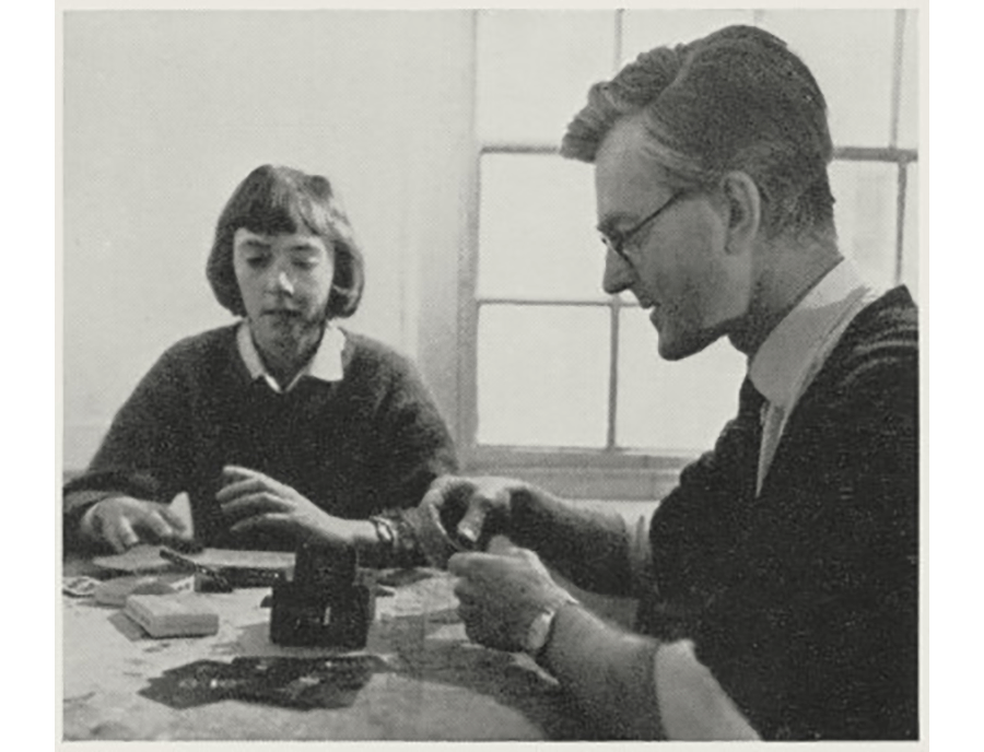
They [↑] worked intuitively and quickly. Calvert described their research and testing approach:
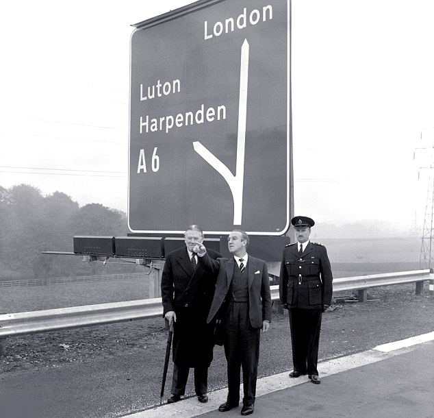
The first signs appeared in 1958. Calvert and Kinneir drove up the motorway for its official opening, but never made it there. She recalls:
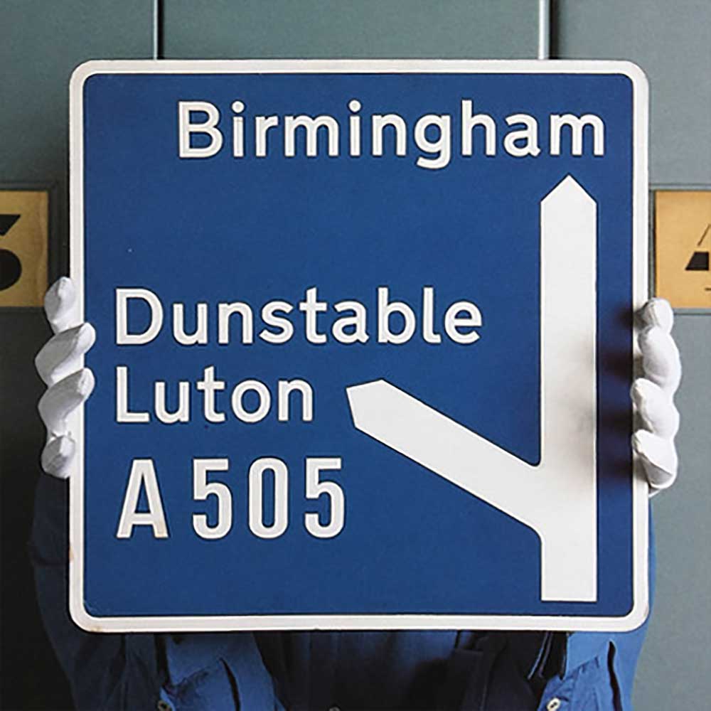
If this takes off it’s going to be the biggest job that any graphic design team has ever tackled.After working on the design of a comprehensive signage system for Gatwick Airport in London, Kinneir was tapped to design signs for the new British motorways. Motorways would have restricted access, wider lanes, and higher speeds and so, to be legible, the signs would need to be completely reconsidered. Kinneir hired his former Chelsea School of Art student Calvert to work on this project. It was a surprisingly small team, but this was also why it worked. (Calvert said later, “Anything bigger would just be another committee.”)
They [↑] worked intuitively and quickly. Calvert described their research and testing approach:
It required completely radical thinking. The information wasn’t there in terms of reading distance, clarity and letter spaces. We had to make up the signs and then test them. It was instinctive.And Kinneir described their design method:
Style never came into it. You were driving towards the absolute essence. How could we reduce the appearance to make the maximum sense and minimum cost.Maquettes were tested in an underground parking garage, a street near the studio, and in London’s Hyde Park where signs were propped up against trees to work out the most effective background colors. Reading distances were worked out ad hoc. Candidates were made, adjusted, re-adjusted. Here is a mockup [↓] of goache, paper, and cowgum.
The first signs appeared in 1958. Calvert and Kinneir drove up the motorway for its official opening, but never made it there. She recalls:
We were invited to the opening of the M1, and we had obviously special permission by the police to go on this motorway. It wasn’t open to the public at that point. It was a beautiful sunny day, blue skies, and then just us, noone else on the motorway. Then we’d see our signs up, and we thought, “Wow!” They just looked so good. They were big, and they sat there and they had their own presence. We just went on and on and on and on. We missed the turn-off or where the actual opening was, and I think we just ended at the end in a ploughed field. But we had a great day. And that’s probably a big moment in my life.Continues in class . . .
March 17, 2025
What language shall we speak?
Readings
Searching for a Black Aesthetic in American Graphic Design (Sylvia Harris)
Resources
Sylvia Harris: 2014 AIGA Medalist
Brooklyn Independent Television
On Sylvia Harris (David Gibson)
Remembering Sylvia Harris (Jessica Helfand)
Assignment
Research, Reconsider, Repeat (continues)
Sylvia Harris flipped design around the other way. Instead of thinking from the point-of-view of the designer, she considered every project from the perspective of its user. Now, this was anything but standard practice at the time. Today “user-centered design” is ubiquitous, but this wasn't today — it was 1993, and I was lucky enough to be there.
I was fresh out of school and working at Two Twelve Associates, a graphic design firm in New York specializing in “Public Information Design” that she had founded with two Yale School of Art classmates, David Gibson and Juanita Dugdale. Two Twelve was a wonderful setting for a young designer, and I was able to not only work on projects but also observe the projects going on around me. One of these was the project to design the first touchscreen interface for Citibank ATMs. Sylvia led the effort, which started with research.
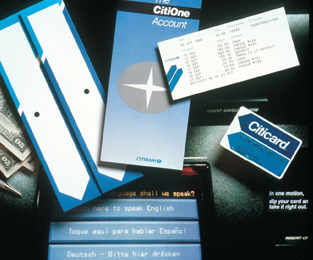
Existing ATM interfaces used the second-person imperative address of machines, with sequential screens of impersonal instructions telling the user what to do next. In distinct contrast, this interface [↑] spoke in the first-person, addressing the user directly. For example, it asks (in this polyglot metropolis),
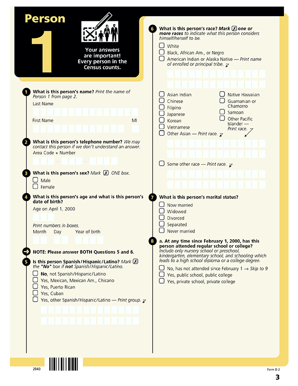
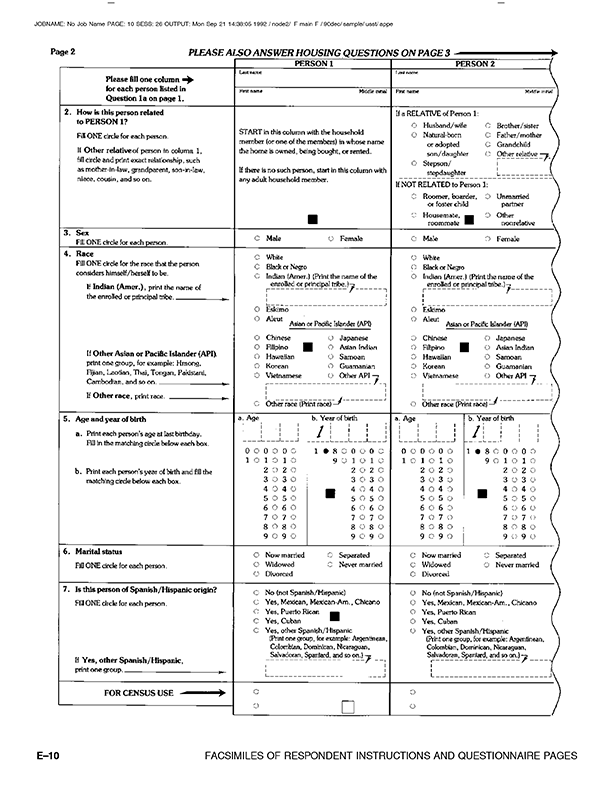
The 2000 U.S. Census looked considerably different from the 1990 version. Like the ATM interface, these begin with a plea to the user, “Your answers are important!” And indeed they were as political power depends on an accurate count of citizens. The stakes could hardly be higher.
Continues in class . . .
I was fresh out of school and working at Two Twelve Associates, a graphic design firm in New York specializing in “Public Information Design” that she had founded with two Yale School of Art classmates, David Gibson and Juanita Dugdale. Two Twelve was a wonderful setting for a young designer, and I was able to not only work on projects but also observe the projects going on around me. One of these was the project to design the first touchscreen interface for Citibank ATMs. Sylvia led the effort, which started with research.
Existing ATM interfaces used the second-person imperative address of machines, with sequential screens of impersonal instructions telling the user what to do next. In distinct contrast, this interface [↑] spoke in the first-person, addressing the user directly. For example, it asks (in this polyglot metropolis),
What language shall we speak?The “we” here is important — this was generous design, a design that considered its user directly, as a partner rather than an operator. It was inclusive. And it was completely different from other bank machines at the time. It was an exceptional project, completed at a very high level for a very wide audience. Sylvia recalled:
My firm got a series of contracts with Citibank to work on the design of the first ATM. I learned everything I know about user testing, product design and strategic planning from that experience. It was like going to graduate school in usability and I made contacts that have lasted to this day.Several years later, she was hired by the United States Census Bureau to bring this user-centered approach to the redesign of the U.S. Census 2000 forms. Sylvia was charged with making the forms easier to use, more legible, and in the process to collect a wider demographic population of responses from the 80 million forms sent out every ten years. As with most of her projects, she started with research. In this case that research started in a classroom at Yale School of Art, where she had introduced an information design class. Together with her MFA students, she developed the redesign of the census form. The results were powerful.
The 2000 U.S. Census looked considerably different from the 1990 version. Like the ATM interface, these begin with a plea to the user, “Your answers are important!” And indeed they were as political power depends on an accurate count of citizens. The stakes could hardly be higher.
Continues in class . . .
March 24, 2025
The prophet who is also the carpenter
Readings
Notes on a Visual Philosophy (Agnes Denes)
Resources
Absolutes and Intermediates
A Gift to the Future: Tree Mountain
Museum of Modern Art collection
Visitor
Emma Enderby
Assignment
Research, Reconsider, Repeat
The prophet who is also the carpenter
Readings
Notes on a Visual Philosophy (Agnes Denes)
Resources
Absolutes and Intermediates
A Gift to the Future: Tree Mountain
Museum of Modern Art collection
Visitor
Emma Enderby
Assignment
Research, Reconsider, Repeat
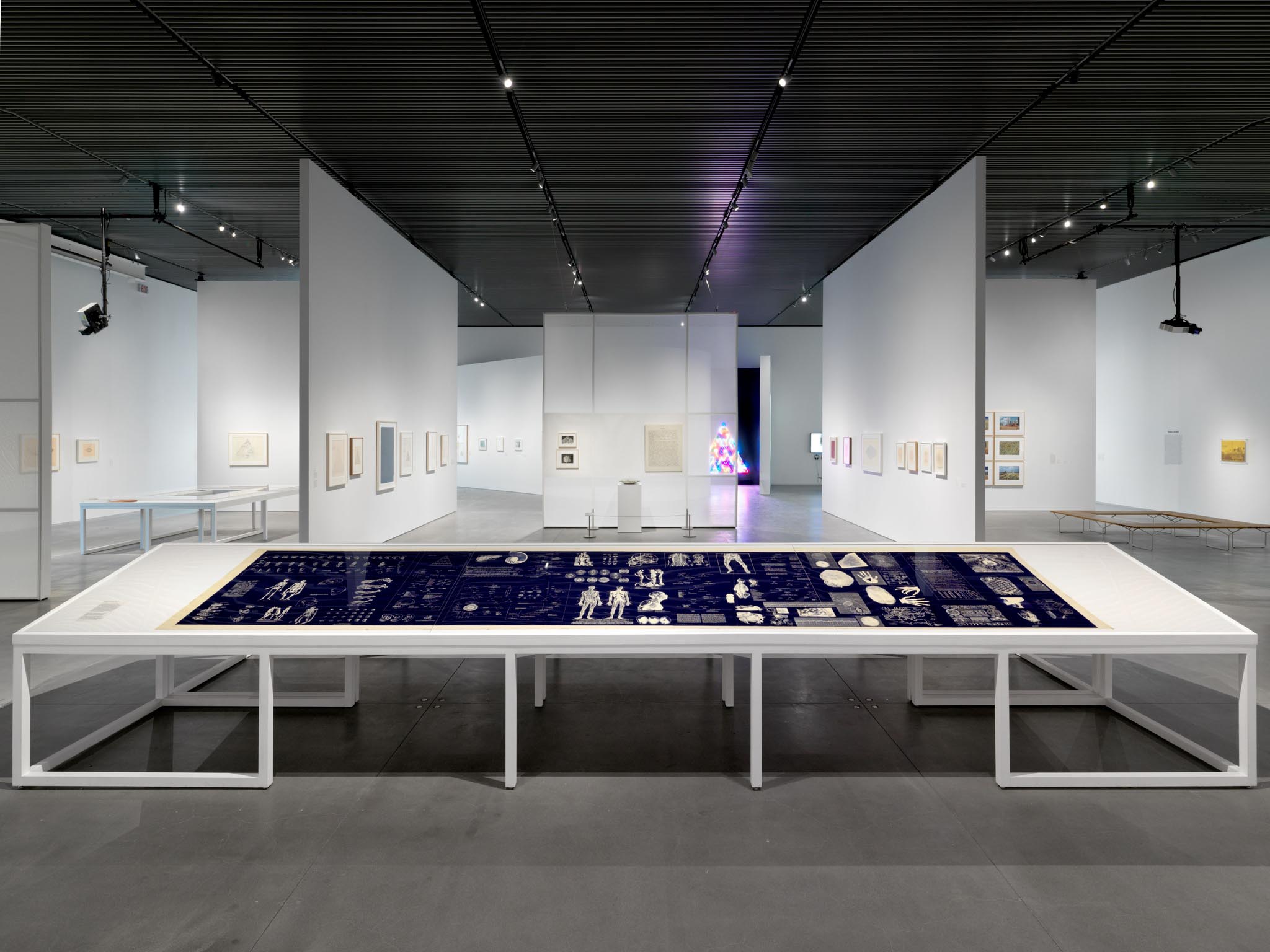
March 6, 2020 — I headed uptown to see (what turned out to be) a flabbergastingly excellent exhibition of the work of Agnes Denes. Curated by Emma Enderby at The Shed, the comprehensive retrospective exhibition collected a life of dense, visionary artworks under the title Absolutes and Intermediates.

I was particularly impressed by a series called The Philosophical Drawings, large-format sheets which collect a series of her drawings on something like a diazotype / x-ray print using a process she invented. You can see one of these installed in the foreground here. This one [↓] is smaller, and called Thought Complex.

It’s from 1971 and Denes describes it as:
Agnes Denes also builds her models. In Tree Mountain — A Living Time Capsule — 11,000 Trees, 11,000 People, 400 Years are planted in a particular geometric spiral. Each tree is deeded to one particular person and passed down through a series of heirs. From 1992 – 1996, the project was realized in Ylojarvi, Finland where a mountain was contructred in a reclaimed gravel pit. Pine trees were planted, and the forest continues to evolve. Here is a drawing [↓].
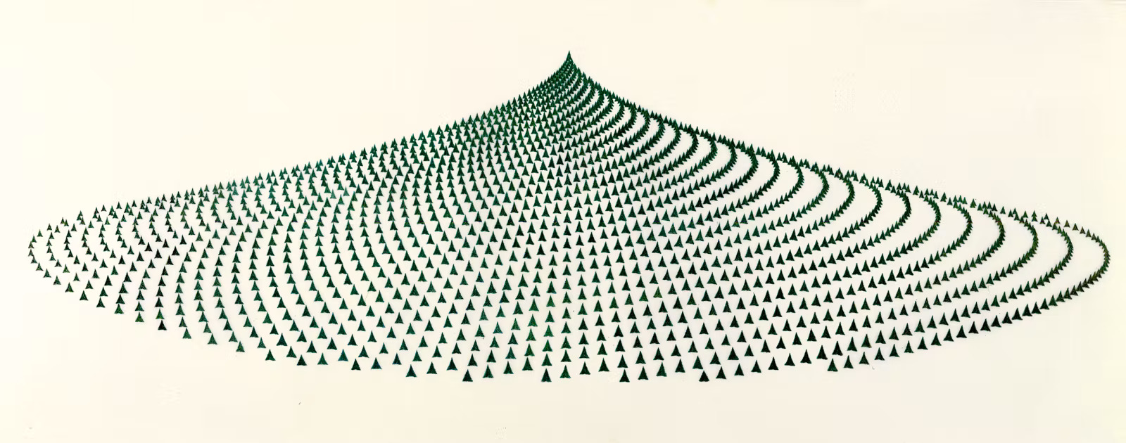
As the title suggests, the work is meant to carry ideas from today into a not-yet-known future via the physical form of a strangely arranged forrest. The work is at least as much a vehicle as it is a metaphor. It is physical, practical, and concrete.
Continues in class . . .
I was particularly impressed by a series called The Philosophical Drawings, large-format sheets which collect a series of her drawings on something like a diazotype / x-ray print using a process she invented. You can see one of these installed in the foreground here. This one [↓] is smaller, and called Thought Complex.
It’s from 1971 and Denes describes it as:
. . . a diagrammatic presentation of a random sample of thought processes applied to crystallography and compared to the growth of crystals. Assume that ideas are balanced momentarily by the surface tension of the mind, just long enough to sprout hairline tentacles that instantly penetrate the machinery of the brain initiating a thinking process. . . . If we could measure these processes and visualize them sequentially and dimensionally as applied to theoretical crystallography, the mind could become as scientifically predictable and depictable as polytopes.This sheet is a surface, something like a pinboard or studio wall, which both *collects* and *conveys* Denes’ research. It is also a kind of visual philosophy. I can’t help but think about the neural networks foundational to artificial intelligence which model thinking as a collection of n-dimensional vector spaces, where any term is distinguished by a particular arrangement of values. In these models, thoughts also become something like crystals.
Agnes Denes also builds her models. In Tree Mountain — A Living Time Capsule — 11,000 Trees, 11,000 People, 400 Years are planted in a particular geometric spiral. Each tree is deeded to one particular person and passed down through a series of heirs. From 1992 – 1996, the project was realized in Ylojarvi, Finland where a mountain was contructred in a reclaimed gravel pit. Pine trees were planted, and the forest continues to evolve. Here is a drawing [↓].
As the title suggests, the work is meant to carry ideas from today into a not-yet-known future via the physical form of a strangely arranged forrest. The work is at least as much a vehicle as it is a metaphor. It is physical, practical, and concrete.
Thus, the artist emerges as a creative problem solver — sensor and sensitizer — the prophet who is also the carpenter.Meanwhile, I was meant to come back to the show on March 11, 2020 with my wife on her birthday. COVID 19 intervened, the lockdown in New York City began, and the exhibition closed.
Continues in class . . .
March 31, 2025
Design Noir
Reading
Design Noir (Anthony Dunne and Fiona Raby)
Speculative Everything (Anthony Dunne and Fiona Raby)
Resources
Dunne & Raby
Museum of Modern Art
How to Build Scenarios
Critical Design FAQ
Tony Dunne & Fiona Raby - Critical Design
Media Lab Award
Assignment
Research, Reconsider, Repeat (continues)
Visitor
Angie Keefer
This is a favorite design book [↓] of mine. Design Noir by Anthony Dunne and Fiona Raby was published in 2001. My copy is pretty beat up, well-used over any number of years. I always like the way that books with white covers inevitably show their age.
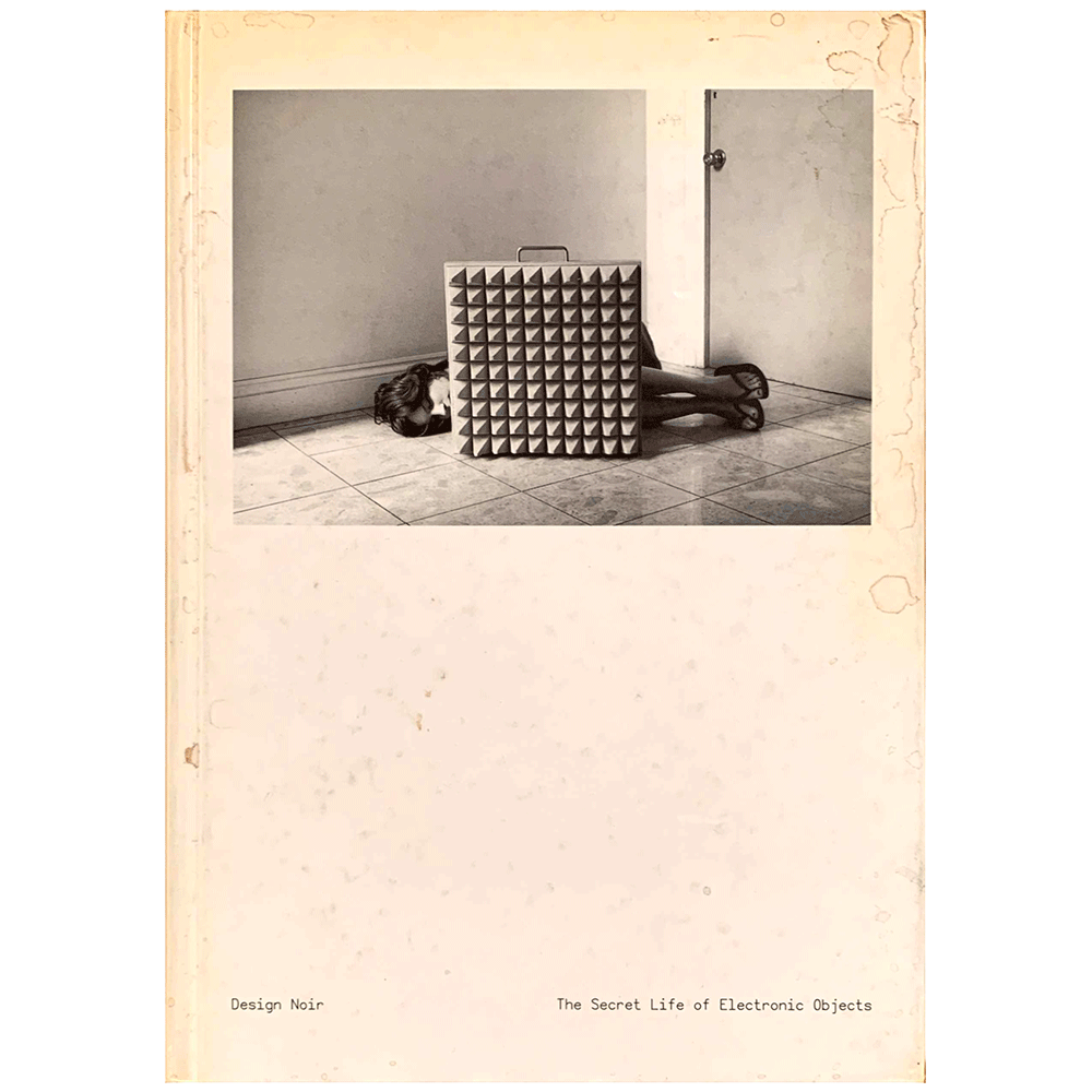
It seems appropriate given what that the book describes:
The term ”Critical Design“ took off, maybe a bit too much. It was soon used for design practices which did little more than produce parodies, blind futurology, or even just entertainment. The term also became a lightning rod for those who thought it was merely art, or that it was technically impossible to critique design from within design. The debate became loud enough that Dunne and Raby maintain a “Critical Design Frequently Asked Questions” page on their website, and the Museum of Modern Art even includes a definition in their “Art terms” online database. And here a work of critical design, Robot 1, which is in the MoMA design collection [↓]:
In a more recent video interview, Fiona Raby clarifies their intent, suggesting what they offer in their work is
It seems appropriate given what that the book describes:
Beneath the glossy surface of official design lurks a dark and strange world driven by real human needs. A place where electronic objects co-star in a noir thriller, working with like-minded individuals to escape normalisation and ensure that even a totally manufactured environment has room for danger, adventure and transgression. We don’t think that design can ever fully anticipate the richness of this unofficial world and neither should it. But it can draw inspiration from it and develop new design approaches and roles so that as our new environment evolves, there is still scope for rich and complex human pleasure.Dunne and Raby have worked together since 1994, with a practice that sits somewhere in the overlaps of industrial design, interaction design, and architecture. They have previously called what they do Critical Design. This is a design practice oriented explicitly in opposition to prevailing modes of design.
The term ”Critical Design“ took off, maybe a bit too much. It was soon used for design practices which did little more than produce parodies, blind futurology, or even just entertainment. The term also became a lightning rod for those who thought it was merely art, or that it was technically impossible to critique design from within design. The debate became loud enough that Dunne and Raby maintain a “Critical Design Frequently Asked Questions” page on their website, and the Museum of Modern Art even includes a definition in their “Art terms” online database. And here a work of critical design, Robot 1, which is in the MoMA design collection [↓]:
In a more recent video interview, Fiona Raby clarifies their intent, suggesting what they offer in their work is
Not an end point, but a counterpoint.Continues in class . . .
April 7, 2025
What did it sound like? How did it feel?
Readings
Martin Luther King’s Powerful Speeches, Captured In a Typeface) (Meg Miller)
Resources
Q & A with David Reinfurt, Design Museum, London
Q & A with Adam Pendleton, Design Museum, London
Assignment
Research, Reconsider, Repeat (check-in #3)
What did it sound like? How did it feel?
Readings
Martin Luther King’s Powerful Speeches, Captured In a Typeface) (Meg Miller)
Resources
Q & A with David Reinfurt, Design Museum, London
Q & A with Adam Pendleton, Design Museum, London
Assignment
Research, Reconsider, Repeat (check-in #3)
In 2018 I was invited to join a team with artist Adam Pendleton and architect David Adjaye to design a monument to Dr. Martin Luther King Jr. and Coretta Scott King on a site at the northeast corner of Boston Common. It was more or less a dream project.
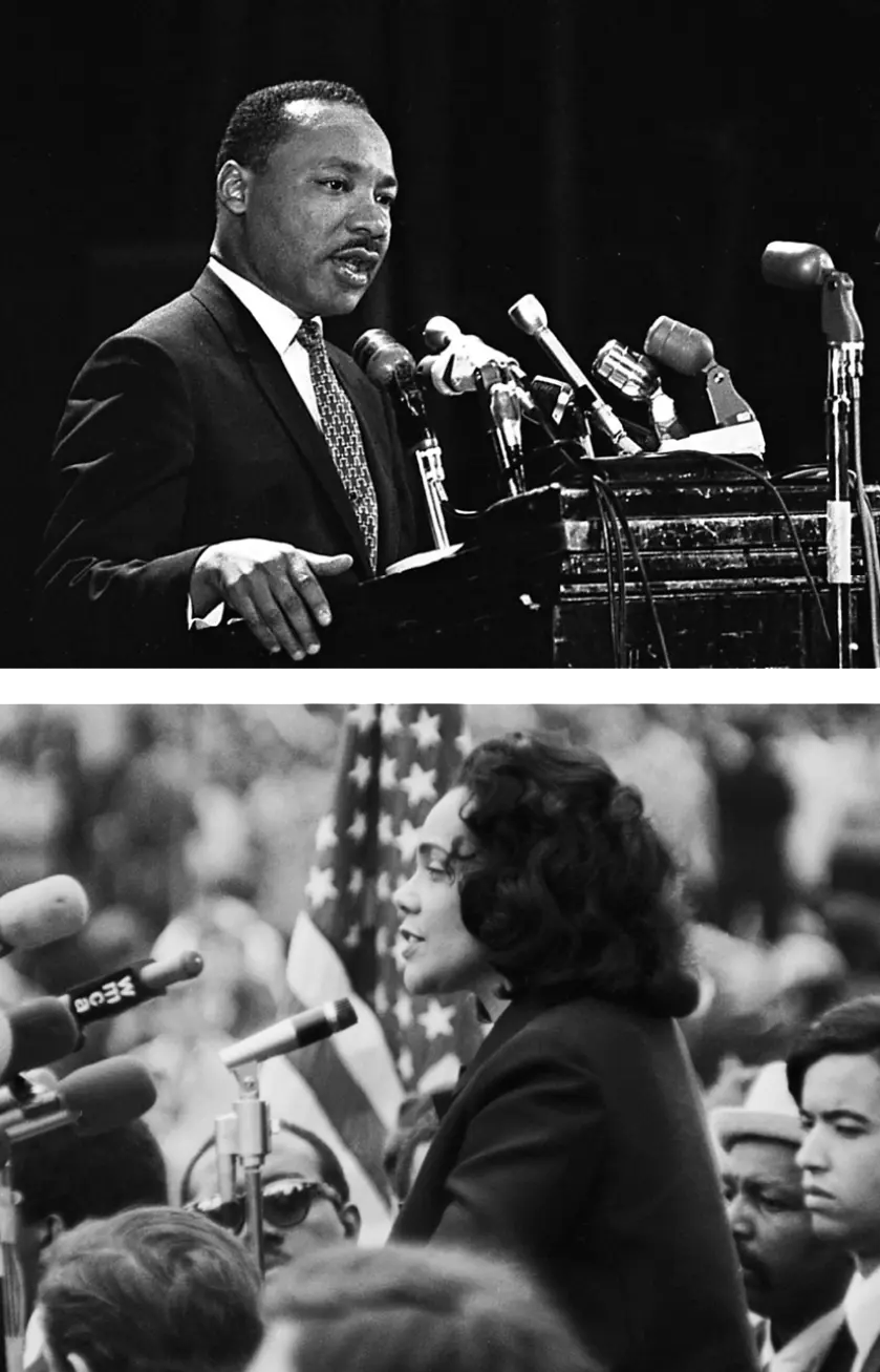
The speeches of the Kings inspired action, and the words they spoke now more than fifty years ago catalyzed a social movement which remains urgent. Their speeches were also virtuosic, moving oratory performances (Adam called them singing). They were calls to action, mobilizing allies in the fight for racial and economic justice. In place of concise quotations typically chosen, we wanted to include the context that surrounded the Kings’ spoken words. What did it sound like? How did it feel? What came next? To this end, we selected only generous excerpts and exclusively from the Kings’ speeches.
Public momuments typically use pithy statements and memorable quotes from written accounts. To honor the long-reaching effects of the Kings’ words, we chose instead to include long excerpts from their public speeches, not from written sources. Meanwhile, the translation of speech into physical text typically falls short. In place of the ubiquitous Roman square capitals carved into stone, I designed Speech-to-Text, a typeface that channels the vitality of the speakers and the era in which they spoke.
Speech-to-Text is based on typewritten notes for the Kings’ speeches from the early 1960s. I adapted Artisan, a font commissioned by for the IBM Selectric typewriter [↑] and not previously digitized. The Selectric was state-of-the-art in 1961, intended to make typing faster and easier.
Speech-to-Text is both faithful to the practical documents of the time, and streamlined for contemporary computers. The new font software is also state-of-the-art, now, incorporating machine learning transcription into a dynamic typeface to produce variable letterforms.
Continues in class . . .
April 14, 2025
"Prototype" and other "Figures of Speech"
In-class
Virgil Abloh, “Insert Complicated Title Here”
Resources
Canary Yelllow
Alaska Alaska
Off-White Show Notes February 28, 2022
A Team with No Sport
Jim Joe
Imaginary TV
Virgil Abloh
Assignment
Research, Reconsider, Repeat (continues)
"Prototype" and other "Figures of Speech"
In-class
Virgil Abloh, “Insert Complicated Title Here”
Resources
Canary Yelllow
Alaska Alaska
Off-White Show Notes February 28, 2022
A Team with No Sport
Jim Joe
Imaginary TV
Virgil Abloh
Assignment
Research, Reconsider, Repeat (continues)
I saw the exhibition of Virgil Abloh [↓] at the Brooklyn Museum twice.
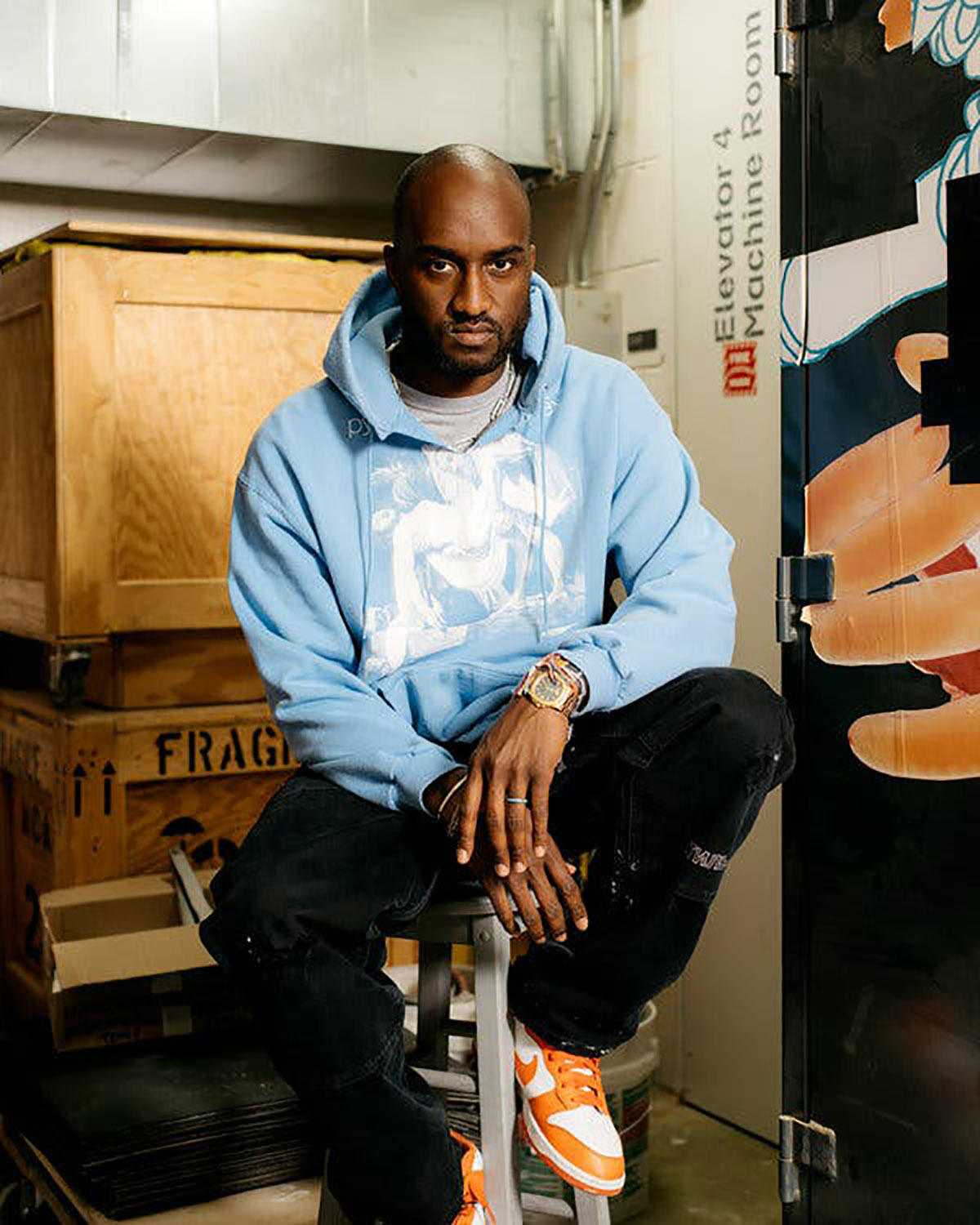
When you walk in, these shoes [↓] sit on a table just to the right, marked as what they are, a work-in-progress, one of many, a "prototype."
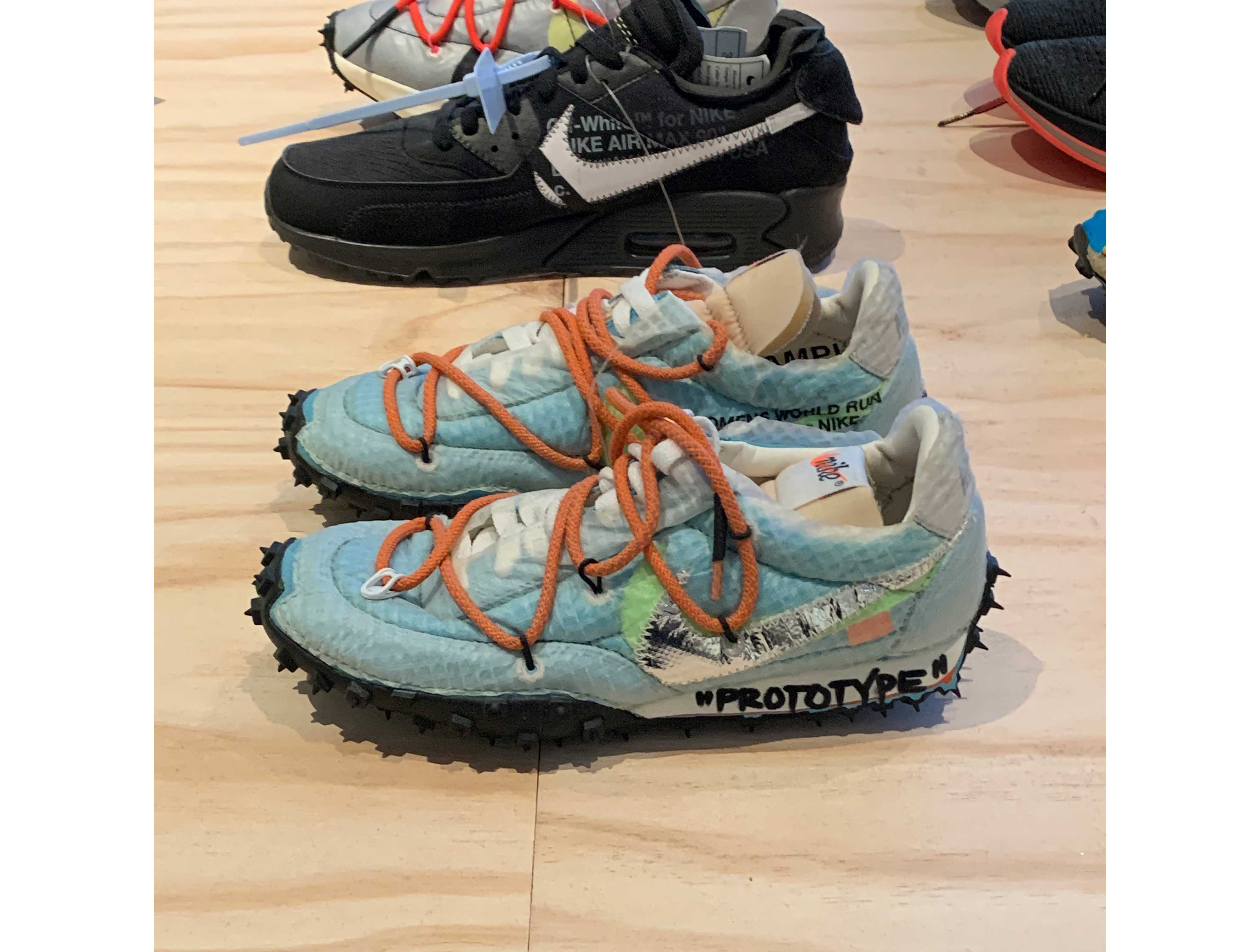
There are maybe 20 pairs of unreleased Nike shoes surrounding these, in various states of de- and re-construction, the fruits of an ongoing collaboration between the shoe-maker and Virgil Abloh’s label, Off-White. According the exhibition materials for Virgil Abloh, "Figures of Speech," these works-in-progress are typical of how he thought about design:
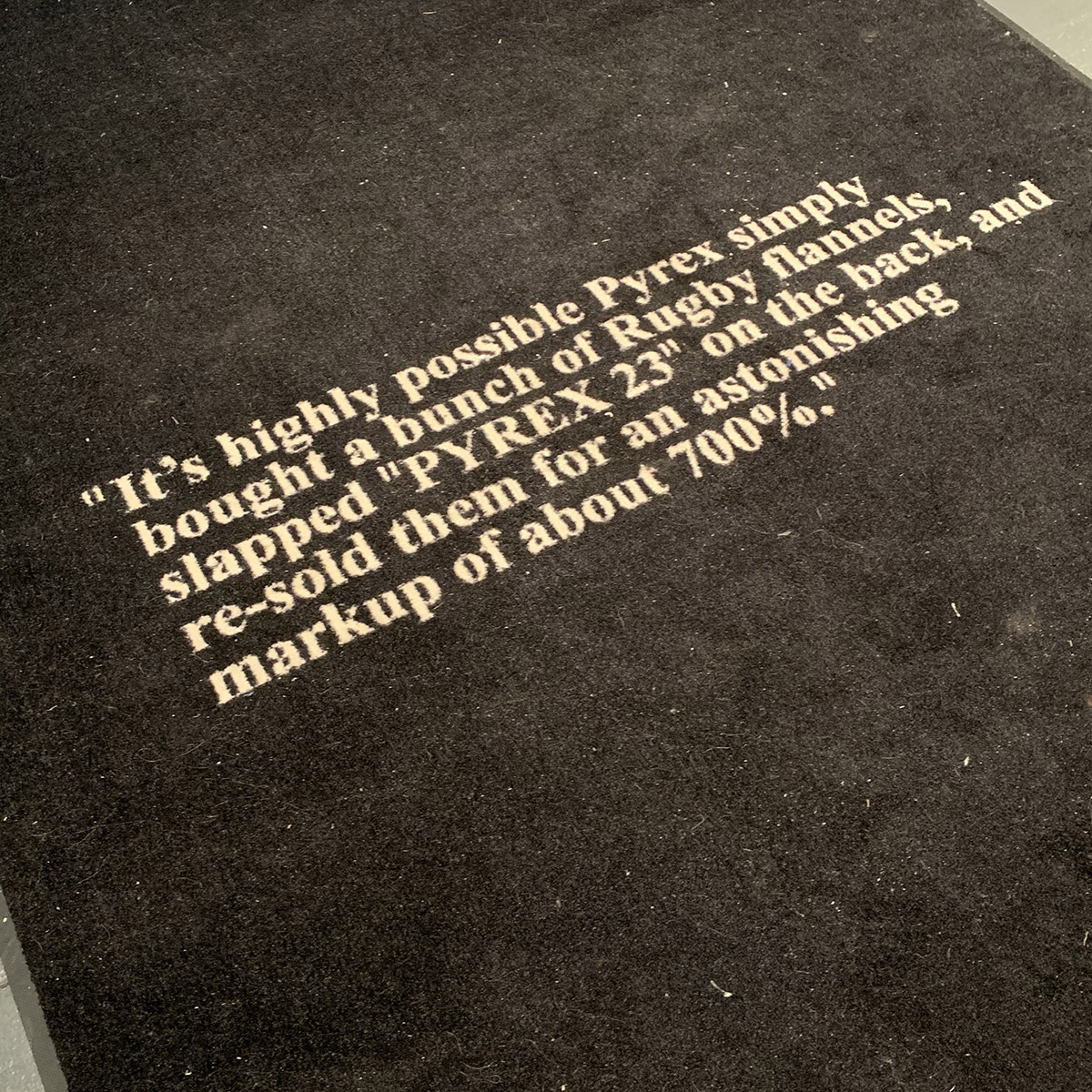
Midway down the table, a set of silkscreens [↓] are laid out. One is a painting by Caravaggio (who you’ll remember from the Enzo Mari class), another combines the words ”Pyrex” and “23.” The constellation of references is (typically) mixed: ”Pyrex” refers to the glassware in home drug labs; “23” was the jersey number of basketball star Michael Jordan; and the Caravaggio painting is The Entombment of Christ (1603).
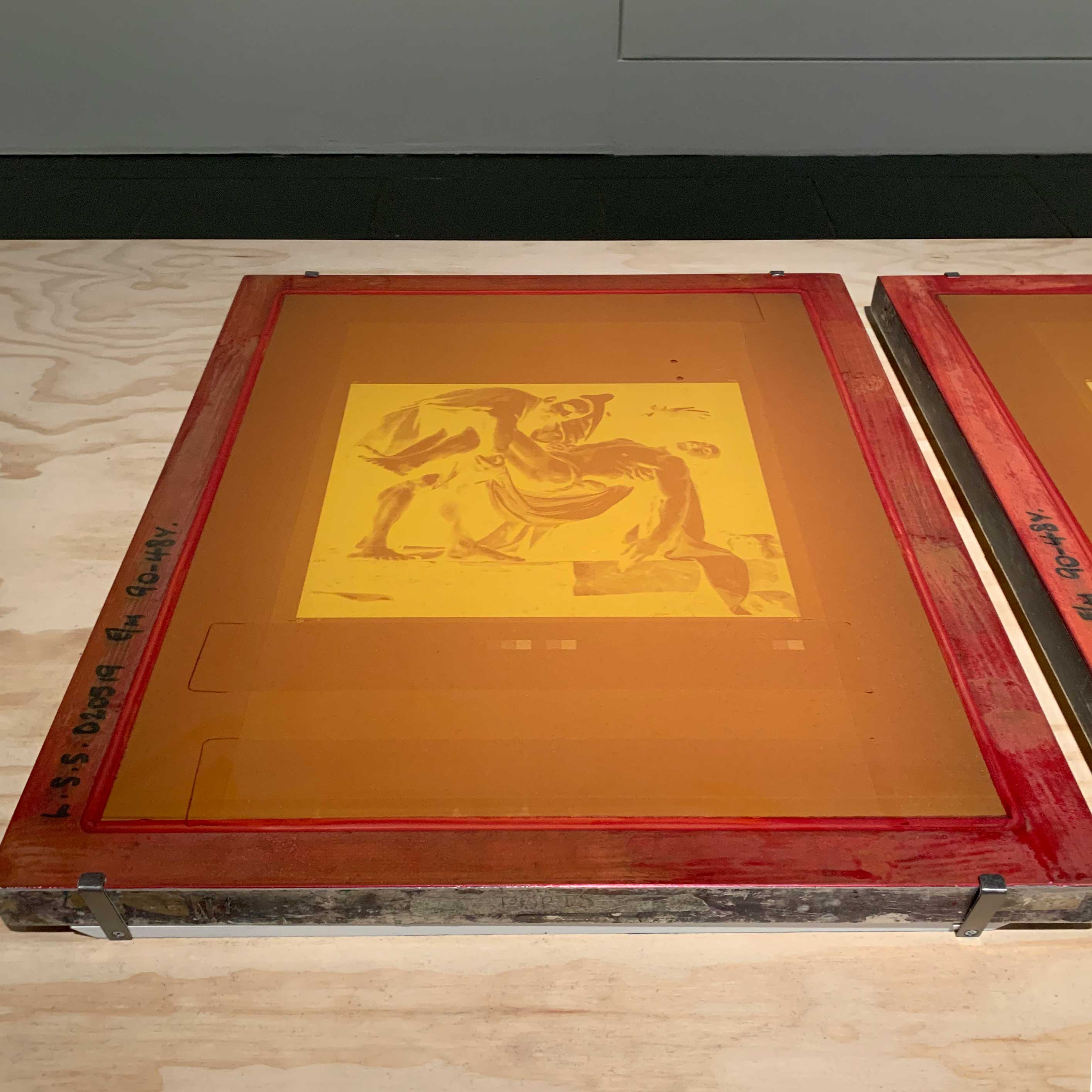
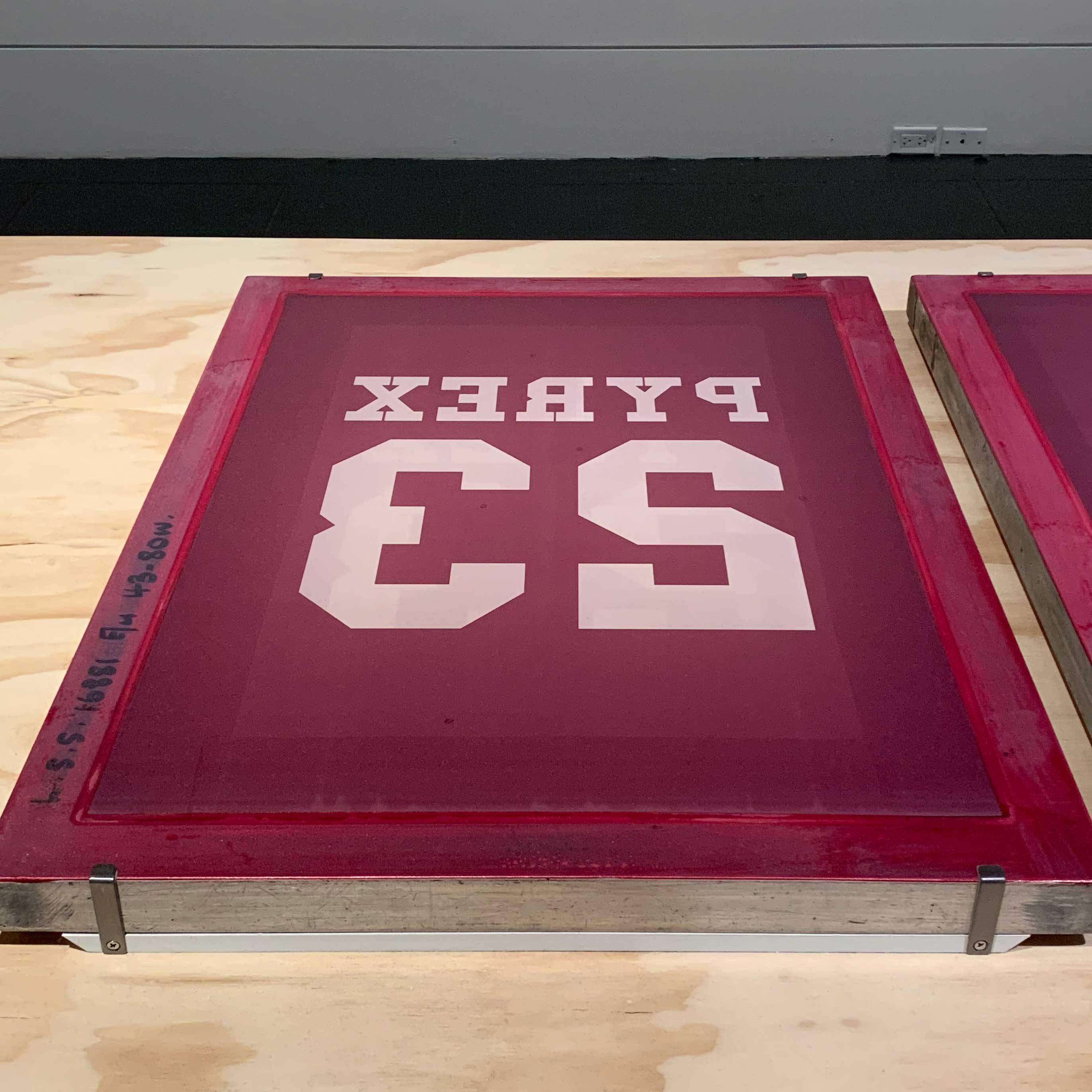
The images were silkscreened directly onto store-bought Champion t-shirts, sweatshirts, and shorts for Abloh’s first clothing line, Pyrex Vision.
Continues in class . . .
When you walk in, these shoes [↓] sit on a table just to the right, marked as what they are, a work-in-progress, one of many, a "prototype."
There are maybe 20 pairs of unreleased Nike shoes surrounding these, in various states of de- and re-construction, the fruits of an ongoing collaboration between the shoe-maker and Virgil Abloh’s label, Off-White. According the exhibition materials for Virgil Abloh, "Figures of Speech," these works-in-progress are typical of how he thought about design:
as much about the process of asking question and prototyping as it was about the final product.The rest of the exhibition consists of so many prototypes. The materials are impressively mixed, inherently uneven, and all presented at the same level. This is one thing I really liked about it. It matched the similarly catholic approach to his work.
prototypes are presented alongside the finished works of art, products, and fashion designs to reveal his myriad inspirations — from centuries-old paintings to contemporary signage at construction sites.Long tables collect the materials. For example, the first includes his high school sketchbook, a brass printing plate for the CD packaging of Watch the Throne (Kanye West and Jay Z), a small video screen showing a fashion shoot at Le Corbusier's Villa Savoye, next to a series of silkscreens used for his Pyrex Vision clothing line, sketches for a character called Jerry Curls, next to jewelry made from paper clips, a custom designed DJ setup, and a Nike tennis dress for Serena Williams. It is a dizzying array of materials and I’m guessing that’s the point. The exhibition design [↑] is by Abloh's studio, Alaska Alaska together with Mahfuz Sultan of Clocks.
Midway down the table, a set of silkscreens [↓] are laid out. One is a painting by Caravaggio (who you’ll remember from the Enzo Mari class), another combines the words ”Pyrex” and “23.” The constellation of references is (typically) mixed: ”Pyrex” refers to the glassware in home drug labs; “23” was the jersey number of basketball star Michael Jordan; and the Caravaggio painting is The Entombment of Christ (1603).
#/media/File:The_Entombment_of_Christ-Caravaggio_(c.1602-3).jpg)
The images were silkscreened directly onto store-bought Champion t-shirts, sweatshirts, and shorts for Abloh’s first clothing line, Pyrex Vision.
Continues in class . . .
April 21, 2025
Like del.icio.us, but better
Resources
R-e-s-e-a-r-c-h videos (Spring 2024)
R-e-s-e-a-r-c-h Are.na channel
Assignment
Research, Reconsider, Repeat (due)
Like del.icio.us, but better
Resources
R-e-s-e-a-r-c-h videos (Spring 2024)
R-e-s-e-a-r-c-h Are.na channel
Assignment
Research, Reconsider, Repeat (due)
There’s a channel on Are.na called How do you describe Are.na at a party? Wonderfully self-reflexive, it’s also quite earnest. Here, a few descriptions I particularly like:
To my eyes, this is a perfectly convincing picture of the process of design research. You will notice the lines are hand-drawn. You will notice that the dots that form the spiral are connected, but not in a route following the curve. You will notice the lines hop from dot to dot, connecting the parts in an ordered sequence which, only over time, reveals the big picture — in this case, a spiral. This is one in a sequence of works that Bryce describes in an interview with the Creative Independent.
We are at the end of the semester and I am guessing that each of your spirals has revealed itself. Today you will be showing your work in a 9-minute, scripted and precisely choreographed presentation. These will be recorded, collected, lightly edited, and posted back here on this website for the future to reconsider.
I am very much looking forward.
Continues in class . . .
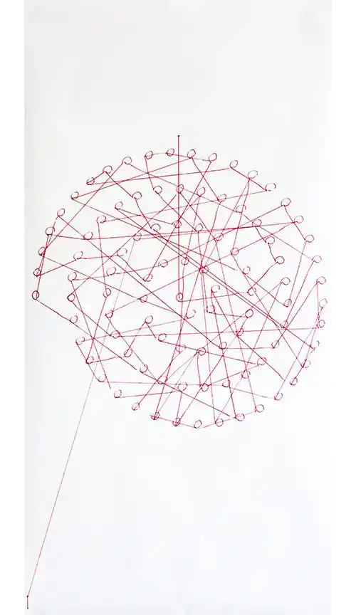
→ internet memory palaceTen years into Are.na’s existence as a slow, considered social network of sorts, Charles Broskowski wrote a blog post, On Motivation, about why to keep going. His post is, naturally enough, illustrated with blocks from the site including this stunner by Bryce Wilner, called Plotter’s Tour (Spiral) (2017) [↓]:
→ random access memories
→ media without the social scramble
→ pattern recognition network
→ like del.icio.us, but better
→ research tumblr
To my eyes, this is a perfectly convincing picture of the process of design research. You will notice the lines are hand-drawn. You will notice that the dots that form the spiral are connected, but not in a route following the curve. You will notice the lines hop from dot to dot, connecting the parts in an ordered sequence which, only over time, reveals the big picture — in this case, a spiral. This is one in a sequence of works that Bryce describes in an interview with the Creative Independent.
We are at the end of the semester and I am guessing that each of your spirals has revealed itself. Today you will be showing your work in a 9-minute, scripted and precisely choreographed presentation. These will be recorded, collected, lightly edited, and posted back here on this website for the future to reconsider.
I am very much looking forward.
Continues in class . . .