Sylvia Harris flipped design around the other way. Instead of thinking from the point-of-view of the designer, she considered every project from the perspective of its user. Now, this was anything but standard practice at the time. Today “user-centered design” is ubiquitous, but this wasn't today — it was 1993, and I was lucky enough to be there.

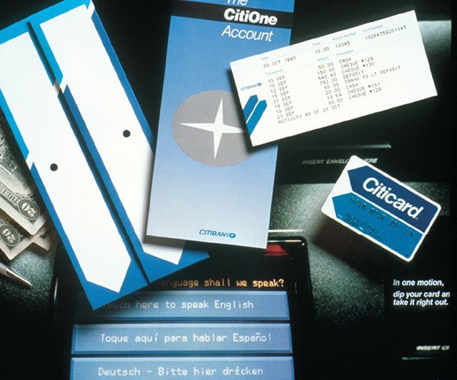
I was fresh out of school and working at Two Twelve Associates, a graphic design firm in New York specializing in “Public Information Design” that she had founded with two Yale School of Art classmates, David Gibson and Juanita Dugdale. Two Twelve was a wonderful setting for a young designer, and I was able to not only work on projects but also observe the projects going on around me. One of these was the project to design the first touchscreen interface for Citibank ATMs. Sylvia led the effort, which started with research.

Existing ATM interfaces used the second-person imperative address of machines, with sequential screens of impersonal instructions telling the user what to do next. In distinct contrast, this interface [↑] spoke in the first-person, addressing the user directly. For example, it asks (in this polyglot metropolis),
The 2000 U.S. Census looked considerably different from the 1990 version. Like the ATM interface, these begin with a plea to the user, “Your answers are important!” And indeed they were as political power depends on an accurate count of citizens. The stakes could hardly be higher.
Continues in class . . .

I was fresh out of school and working at Two Twelve Associates, a graphic design firm in New York specializing in “Public Information Design” that she had founded with two Yale School of Art classmates, David Gibson and Juanita Dugdale. Two Twelve was a wonderful setting for a young designer, and I was able to not only work on projects but also observe the projects going on around me. One of these was the project to design the first touchscreen interface for Citibank ATMs. Sylvia led the effort, which started with research.

Existing ATM interfaces used the second-person imperative address of machines, with sequential screens of impersonal instructions telling the user what to do next. In distinct contrast, this interface [↑] spoke in the first-person, addressing the user directly. For example, it asks (in this polyglot metropolis),
What language shall we speak?The “we” here is important — this was generous design, a design that considered its user directly, as a partner rather than an operator. It was inclusive. And it was completely different from other bank machines at the time. It was an exceptional project, completed at a very high level for a very wide audience. Sylvia recalled:
My firm got a series of contracts with Citibank to work on the design of the first ATM. I learned everything I know about user testing, product design and strategic planning from that experience. It was like going to graduate school in usability and I made contacts that have lasted to this day.Several years later, she was hired by the United States Census Bureau to bring this user-centered approach to the redesign of the U.S. Census 2000 forms. Sylvia was charged with making the forms easier to use, more legible, and in the process to collect a wider demographic population of responses from the 80 million forms sent out every ten years. As with most of her projects, she started with research. In this case that research started in a classroom at Yale School of Art, where she had introduced an information design class. Together with her MFA students, she developed the redesign of the census form. The results were powerful.
The 2000 U.S. Census looked considerably different from the 1990 version. Like the ATM interface, these begin with a plea to the user, “Your answers are important!” And indeed they were as political power depends on an accurate count of citizens. The stakes could hardly be higher.
Continues in class . . .
March 25, 2024
What language shall we speak?
Readings
Searching for a Black Aesthetic in American Graphic Design (Sylvia Harris)
Resources
Sylvia Harris: 2014 AIGA Medalist
Brooklyn Independent Television
On Sylvia Harris (David Gibson)
Remembering Sylvia Harris (Jessica Helfand)
Assignment
Research, Reconsider, Repeat (continues)